
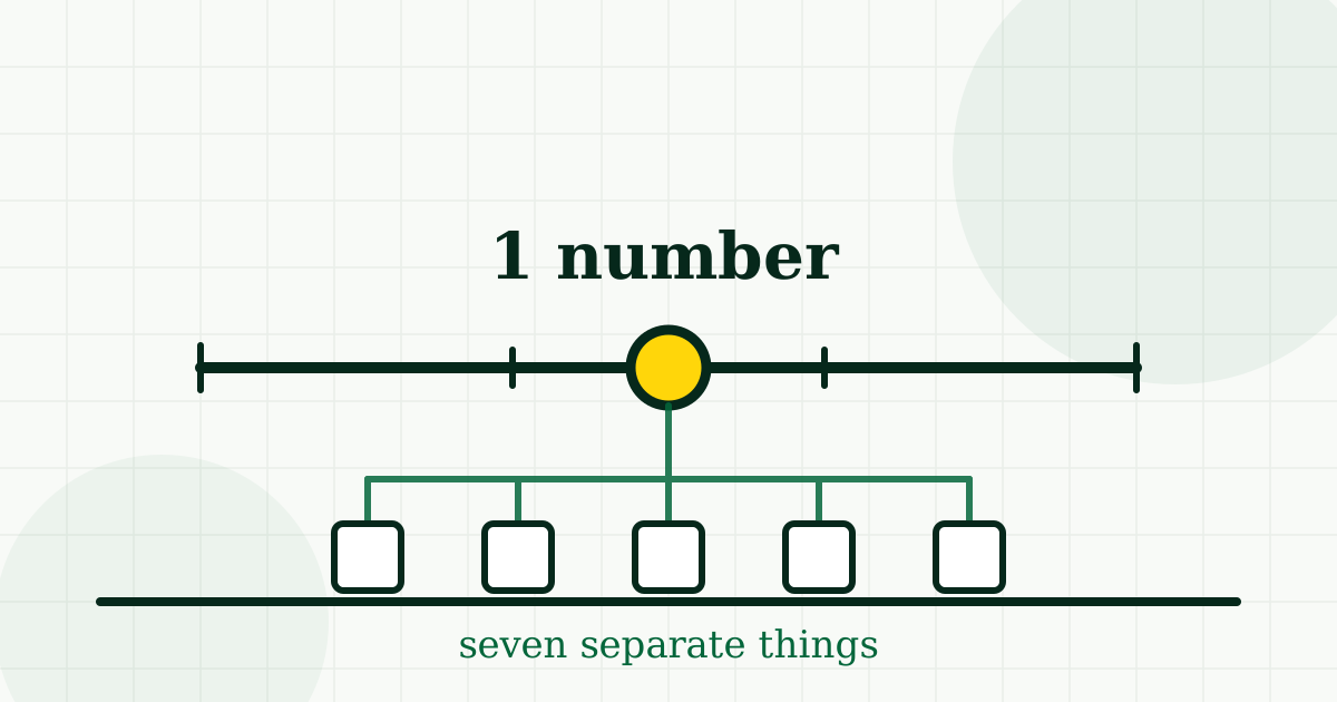
Deprivation rank is one of the most useful numbers in UK open data and one of the most misread. People see a low rank and hear "bad area". That is not what it says, and the gap between the two is worth understanding before you let it move a house off your shortlist.
Seven things, wearing one number
The English Index of Multiple Deprivation is not a measure of one thing. It combines seven separate domains, each built from its own indicators and given its own weight:
- Income — people on low incomes
- Employment — people involuntarily out of work
- Education, skills and training — attainment and adult skills
- Health deprivation and disability
- Crime
- Barriers to housing and services — affordability and distance to services
- Living environment — housing quality, air quality, road casualties
That composition is the whole point, and it is also where the misreading starts. An area can rank as more deprived almost entirely on income and employment while having perfectly ordinary crime and good air quality. Another can rank the same way for completely different reasons.
Two areas with identical ranks can be nothing like each other. The rank does not tell you which is which — the individual domains do.
A rank is relative, not a verdict
The IMD ranks every small area in England against every other and expresses the result as a position, usually summarised into tenths. So a rank says where an area sits in a queue, not whether living there is good or bad.
Somewhere has to be in the bottom tenth. That is arithmetic, not a description. And because it is relative, an area can move down the ranking while getting better in absolute terms, simply because other places improved faster.
The geography is smaller than a ward and bigger than a street
Ranks are published for Lower Layer Super Output Areas — statistical zones of roughly 1,500 people. Not postcodes. Not streets.
This matters most in exactly the places people are researching. A zone can contain a well-kept terrace and an estate with real problems, and it gets one number for both. If you have stood on the street and it did not match the rank, you were probably both right.
It stops at the border
Each nation publishes its own index — the IMD in England, the SIMD in Scotland, the WIMD in Wales, the NIMDM in Northern Ireland. Different indicators, different weightings, ranked within that nation only.
A rank of 2,000 in England and a rank of 2,000 in Scotland have nothing to say to each other. We do not offer a cross-border comparison, because there is no honest way to build one.
How to read it usefully
- Use it to raise questions, not to answer them. A surprising rank means "look closer here", not "rule it out".
- Go to the domain you actually care about. Worried about schools? Look at school performance. Worried about crime? Look at crime. The composite is the least precise answer to any specific question.
- Read it alongside the direction of travel. The indices are published every few years; an area's movement between releases is often more informative than its position in one.
- Never use it as a proxy for the people who live there. It describes measured circumstances in a statistical zone. It is not a description of anybody's character, and it is a poor guide to what a street feels like to walk down.
Why we show it at all
Because it is the single best summary of the material circumstances of a small area that anyone publishes, and leaving it out would be its own kind of dishonesty — a site that shows house prices and hides deprivation is telling you half of something.
We show the rank, name the index and the year, and put the individual measures beside it so that the composite is never the only thing on the page. A number that can be misread is worth showing with the things that stop it being misread.


Comments
Loading…
Comments are open to members, so every one is attached to a real account.